
I have always had a passion for fashion, but I also have always been acutely aware of how the fast fashion industry negatively impacts our environment. Being born and raised in Oregon I have had the immense privilege of being surrounded by the beautiful outdoors. As a lifetime skier, sailor, and swimmer I can recognize how none of those pastimes would be possible without the current environment we have. That is why I have become passionate about combining my interest in fashion with my love for the environment.
One effective and engaging way to educate people about current issues is through the use of Infographics. As humans, we are incredibly visual learners. That’s why infographics are so popular. By combining visual media with relevant data points the message becomes more effective. Below I analyze some of my favorite infographics about the fast fashion industry and its impact on the environment.
Infographic #1:
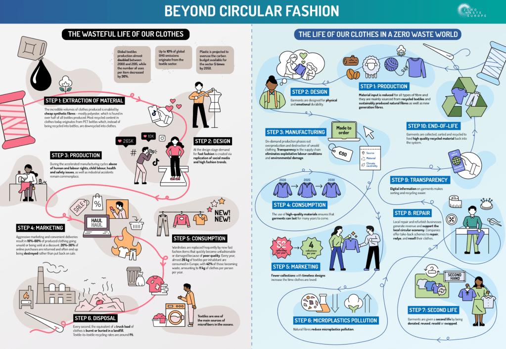
This infographic is great because it provides a visual path for readers to follow to see the lifespan of clothing in our current environment. It is a bit busy and could benefit from reducing some of the visual clutter to make the important points stand out more. The visual hierarchy of this infographic is good and by starting at the top and working its way down it creates an easy reading experience. The color story also plays a huge role in the effectiveness of the infographic. As we can see the left side of the infographic utilizes colors such as red, black, and orange to evoke a sense of unease in the reader. On the contrary, the right side of the infographic includes colors such as blue and green which remind the readers of the earth and sustainability. There is a balance between the text and the visuals but I believe it could benefit from being more simple. This would help the big facts stand out even more. In the end, the story that this infographic tells is one of hope and how we can change our current clothing practices to align with a more sustainable future.
Infographic #2:

I love this infographic. It is simple and straight to the point, it also includes a clear call to action at the bottom. In terms of visual hierarchy, the infographic does a good job of starting with the most important information at the top and working its way down to the call to action. I do think the color choices could be more effective if the creator utilized colors such as blue and green which are associated with sustainability. This infographic is incredibly easy to read but I would consider changing the font to a sans-serif version just to make it pop a bit more. The balance of text and visuals is great and I love the use of a t-shirt and water droplets to demonstrate their message. Overall, this infographic does a great job at being simple, straight to the point, and effective.
As I go forward and make my infographic I want to pull some inspiration from the infographics above. I love the use of contrasting colors in the first infographic to tell a story and I want to incorporate that in my infographic. I also really like how simple the second infographic is. It makes the information easy to digest and I plan on using a more simple design when creating my infographic.
Sources:

Leave a comment